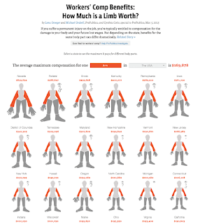
In the Fall of 2014 Lena Groeger, the graphics director at ProPublica, emailed me to ask about a project she was working on. It was a visualization of the compensation that U.S. workers receive for damaged body parts; the amount depends on the state where the worker is. Lena wanted my opinion about using “a little person that represents each state, and size each body part according to difference from the national average.”
My reaction was quick and visceral. I replied that I wouldn't do it because it looked creepy and her illustrations sent “shivers down my spine.” Instead I recommended to use traditional maps and graphs.
Lena is a wise journalist and designer, so she chose to ignore me. The result was one of the most widely read graphics she's ever created. It was picked up by multiple news organizations —Gawker linked to it with the title 'How Much Are Your Balls Worth?'— and led to discussions about policy in several states.
Think about this anecdote whenever visualization “thought leaders” —I've always rejected that label, as it really sends shivers down my spine— claim to know what we're talking about.

